Microsoft Clarity
Session recordings showed where flows broke.
Solving for user trust
Role
Design systems & checkout pod lead
Timeline
March 2023 – January 2024
Organization
MakeO (formerly Toothsi)
Team
3 designers
Markets
India and UAE
Results at a glance
34%lower KLM score
42%drop-off reduction
-3 daysfrom PRD to design
Overview
MakeO offers two services: teeth alignment (toothsi) and laser hair removal and facial (skinnsi). Both were losing users in their main journey, which meant more marketing follow-ups and fewer conversions.
I led the design systems team for this project.
We created the design system elements.
We shipped it with developers and explained how tokens carry the system across the organization.
I led accessibility for the project.
I helped the QA team develop design-oriented testing skills.
Problem
About half the users left each checkout journey before reaching payment. Across the whole journey, around 85% dropped off, so most people neither booked a scan nor paid.
Where users dropped off
Where it happened
Most of it happened at login, pincode, the map and slot selection.
How we found out
Session recordings showed where flows broke.
Bugs logged by QA flagged breakages and inconsistencies.
User feedback from calls showed what confused people.
In the audit, we checked the marketing feedback against Clarity recordings to confirm where the flows broke.
Why it happened
Screens had been built one at a time, with no shared rules for labels, feedback or layout, and the small breakages piled up on the busiest steps. So we decided to fix the system rather than patch screens.
Map, a major drop-off point
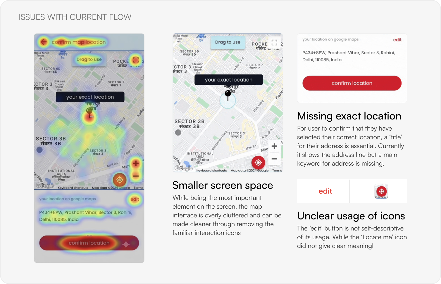
The map is the key element, but familiar icons clutter it.
The address line lacks a main keyword, so users can’t confirm the right place.
“Edit” isn’t self-descriptive and “Locate me” has no clear meaning.
Coupon code, also found in the audit
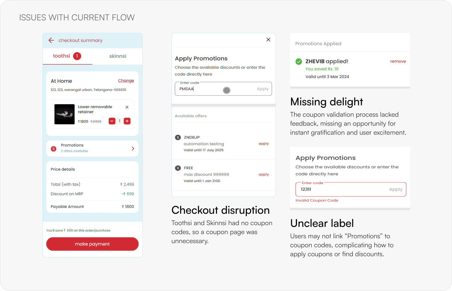
Toothsi and skinnsi had no coupon codes, so a separate coupon page only interrupted checkout.
Validation gave no feedback, missing a moment of delight.
Users may not link “Promotions” with coupon codes.
Solution
Instead of one checkout feature, we overhauled the design system and modernized the UX to lift conversion at scale. Three moves did it.
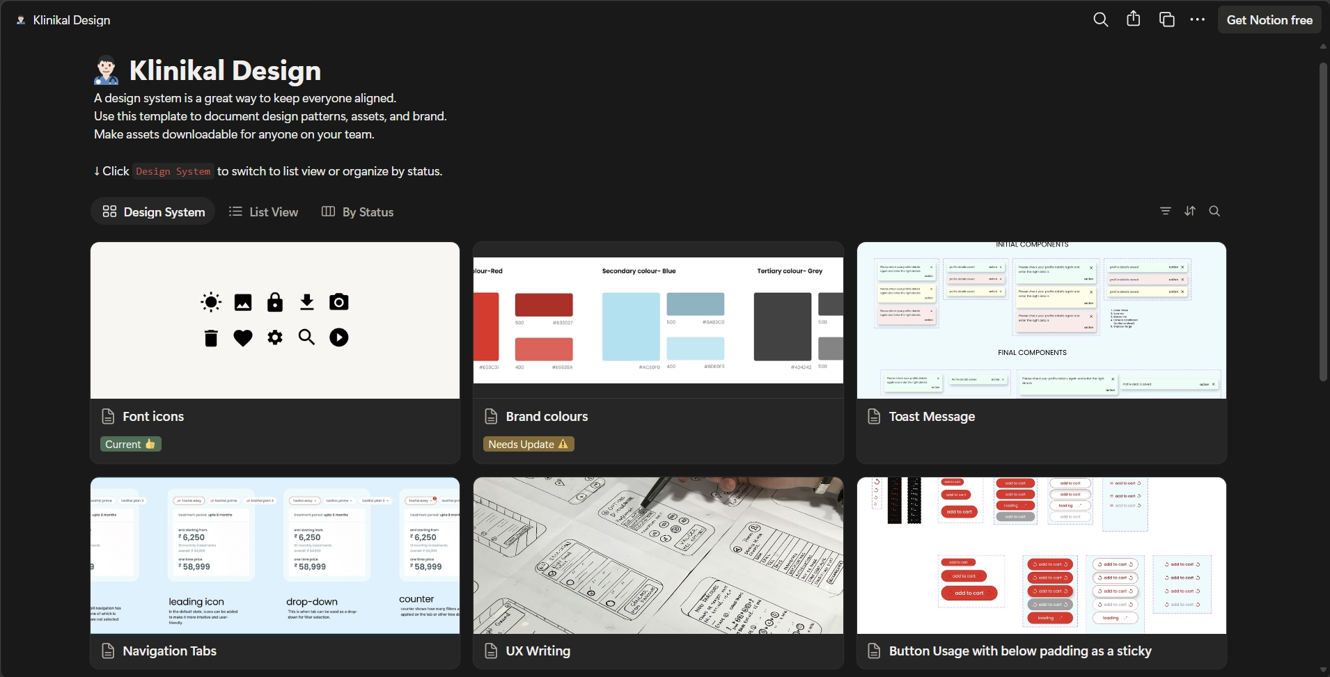
Shared tokens and reusable components for consistent, faster design and production.
We rebuilt the screens both services share (pincode, map, slots and promotions) once, so each fix reached both.
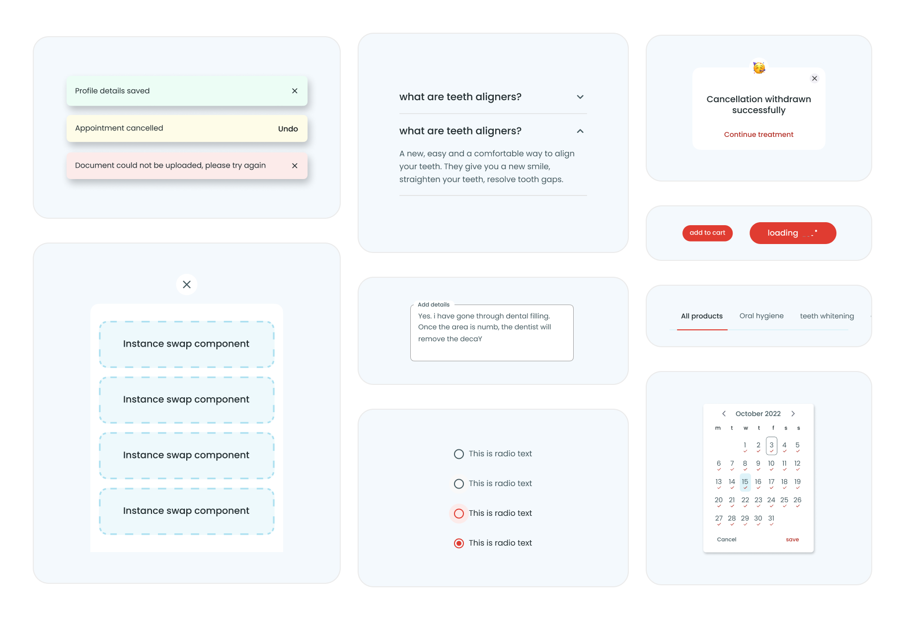
Loaders, toasts and button feedback, so the flow no longer feels abrupt.
Initial findings
Rebuilding from the design system up fixed lots of small frictions at once, in validation, hierarchy and perceived speed, without breaking users’ mental model.
Trade-offs
Six calls that shaped the work, and why we made them.
Research
Both journeys needed one shared approach to fix the inaccessible flows in the app.
A
Toothsi and skinnsi share components and screens, so fixing the common ones helps both flows fastest.
B
One source of truth for design, development and product, built on reusable components.
C
The design system and testing helped us build journeys that are accessible and easy to use.
Toothsi and skinnsi share onboarding, then split into clinical treatment and e-commerce checkout. Orange marks the steps we worked on.
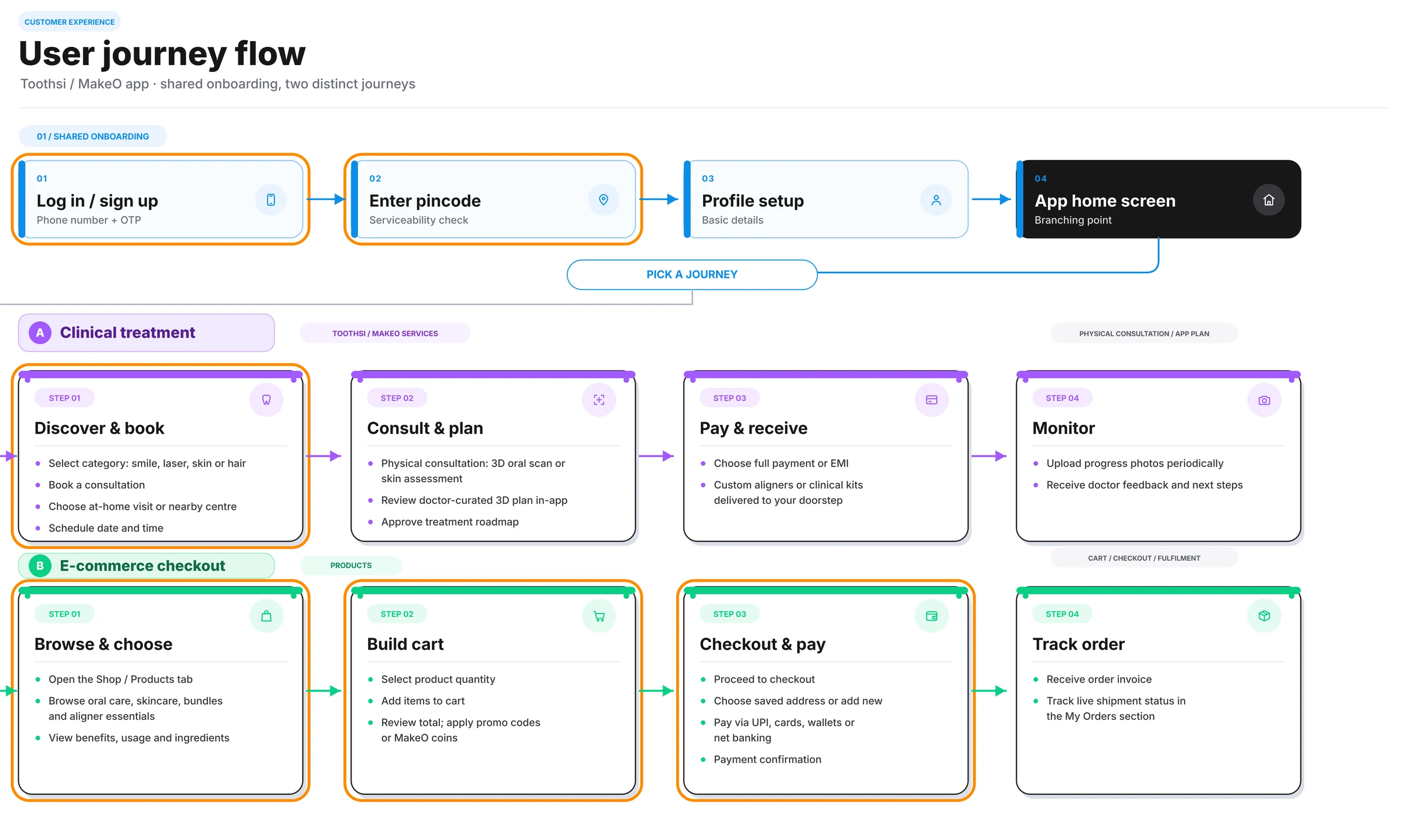
Shared onboarding
Every user starts here, before picking a journey. We worked on log in and the pincode serviceability check.
Journey A · Clinical treatment
Users choose a category, book a consultation, pick a home visit or nearby centre, and schedule a time.
Journey B · E-commerce checkout
From the Shop tab to checkout: select products, apply promo codes, choose an address and pay by UPI, card, wallet or net banking.
System
We listed the essential components first to keep the UI consistent across products. The full story is in the Klinikal design system study.
Pastel palette, accessibility-checked
Figma + Strapi, consistent icons

For rapid icon shipment
Mobile-first, phase 1
Token-based components
Company-wide, not designer-only
Instance swap over one-size-fits-all
Flows
What changed in pin code, location, coupon, slots and motion, and how each one looks now.
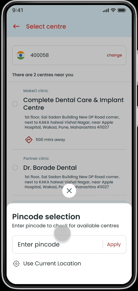
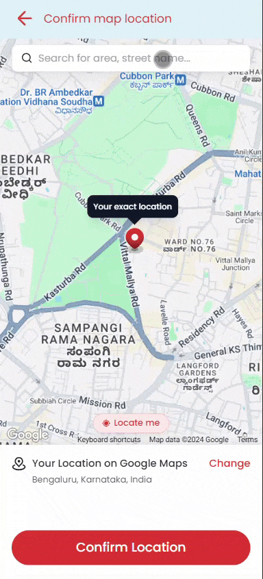
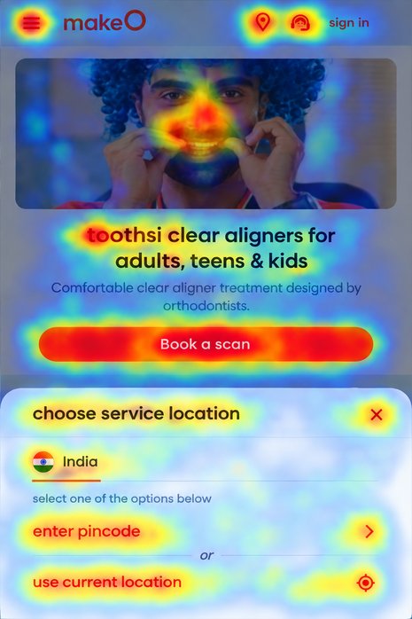
The location selector now adapts to users in India and the UAE, using their IP address to skip steps.
Before
Users enter their home address for the partner’s visit. The old screen reloaded fully on every map refresh. The new one adds a skeleton loader, search, a better “locate me” and cleaner controls, fixing friction points 1 to 3.
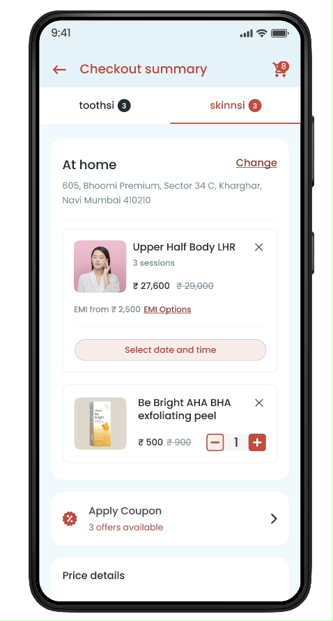
Coupons moved into a bottom sheet over the checkout summary, which now shows whether any offers are available, fixing friction points 4 to 6.
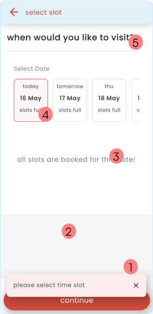
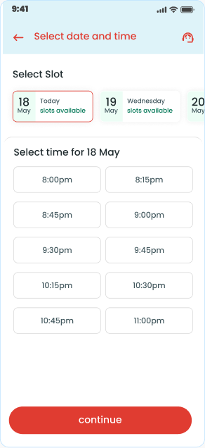
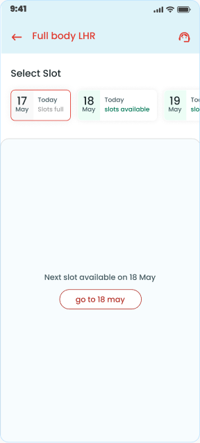
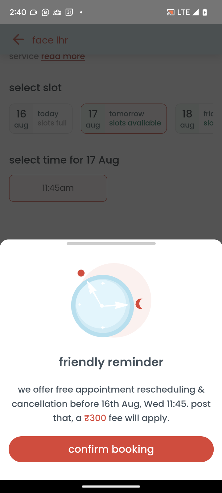
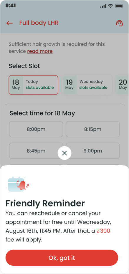
Slot selection left users guessing. Date tabs now show availability, a button jumps to the next open date, and the toast no longer covers the main button. The reminder was reworded so its button doesn’t imply the booking still needs confirming.
Slot selection
Friendly reminder
Add to cart button
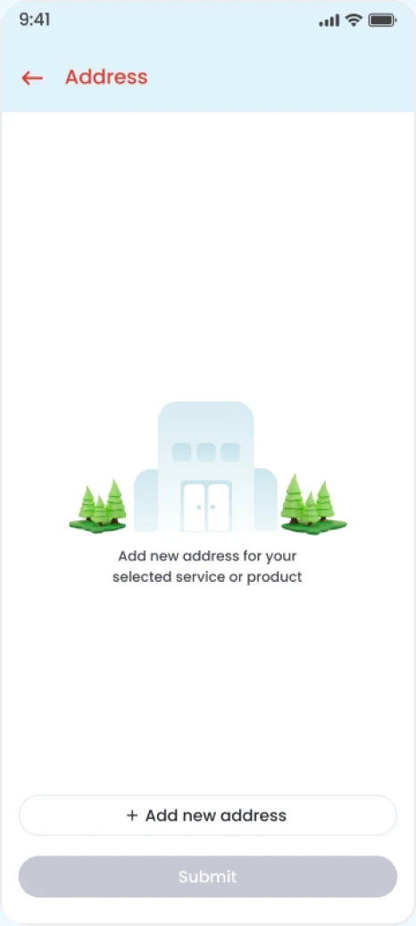
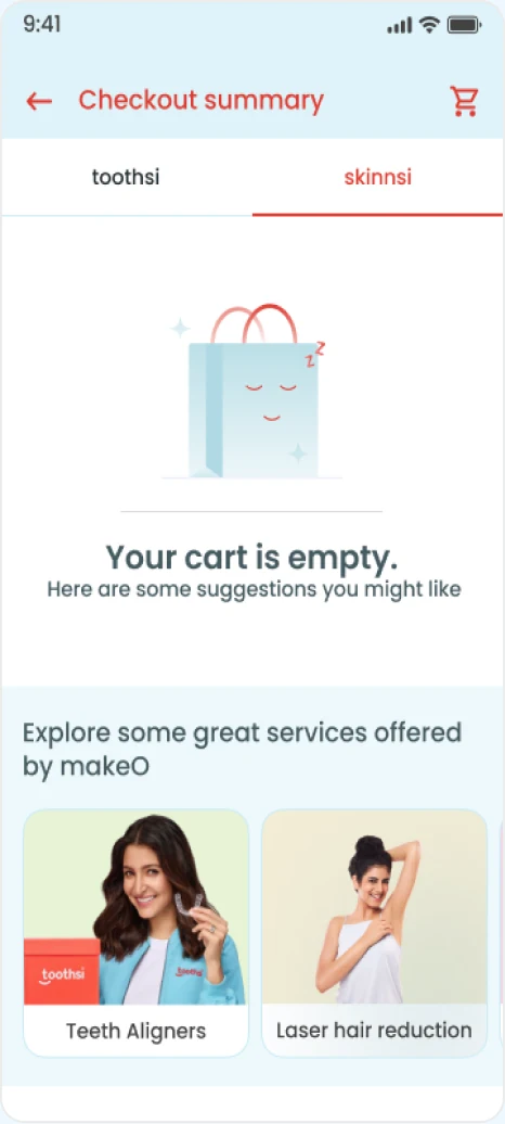
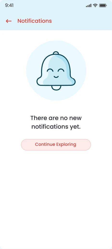
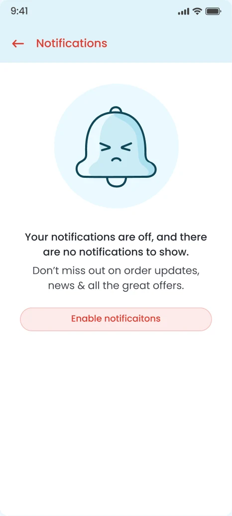
Meaningful interactions and illustrations across the process
Skeleton loaders
Illustration language
Outcome
14+ components entered the design system for product and tech teams, with 100+ enhancements across checkout and onboarding.
Impact
34%
An AI score predictor showed flow time falling from 30.43 to 20.82 seconds.
42%
Microsoft Clarity tracked the drop-off reduction in the revamped flow.
-3 days
The design system cut cognitive load for design and production, speeding the path from PRD to design and build.
“Standardizing our icon pipeline with Strapi and the bottom drawer made developers self-sufficient. Icons became consistent, load times improved, and designers could adapt it easily.”
“The Design Revamp made us realize how fast our system actually was. Design became the means to a better customer experience through a faster checkout process and user perception.”
Design is also a culture of attention to detail. Refinement raised quality, cut QA time and streamlined work between development, design and product.
Structuring large projects around a design system, as with journey refinement, aligns teams on process and unifies implementation.