
Figma component library
Published components and variants, with auto-layout rules. Designers stopped rebuilding the same things, and new screens started from parts that already worked.
One set of tokens, components and docs for four products
Role
Design lead
Duration
6–9 months
Team
3 people
Reach
4 products
Markets
India and UAE
Results at a glance
4products on one system
1–2 dayssaved on every major flow
0icon requests to designers
Overview
makeO (formerly Toothsi) is a dental care startup in India and the UAE. Over a few funding rounds it went from one product to four: a customer app, a service team app, an admin tool and a website. The design setup never caught up.
When I joined, I spent my first three months just finding my way around. Designs were spread across Figma files that didn’t link to each other, nothing was shared, and nobody could say which version of a component was the current one. Every new designer had to work that out alone, as I had. That’s where Klinikal started, the system that later sat behind the MakeO checkout redesign.
“I have always been a systems thinker. Design systems gave me the opportunity to think about the processes that make design more accessible, not just for end users, but for every person who touches a product.”
Problem
Designers kept joining and leaving mid-project, and with nothing shared, each handoff started from zero. Meanwhile customers, service staff and admins were using four products that should have looked and worked like one. When I audited the live app, the same six problems kept coming up.
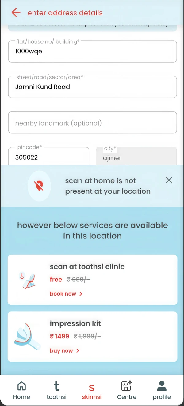 01Footer icons
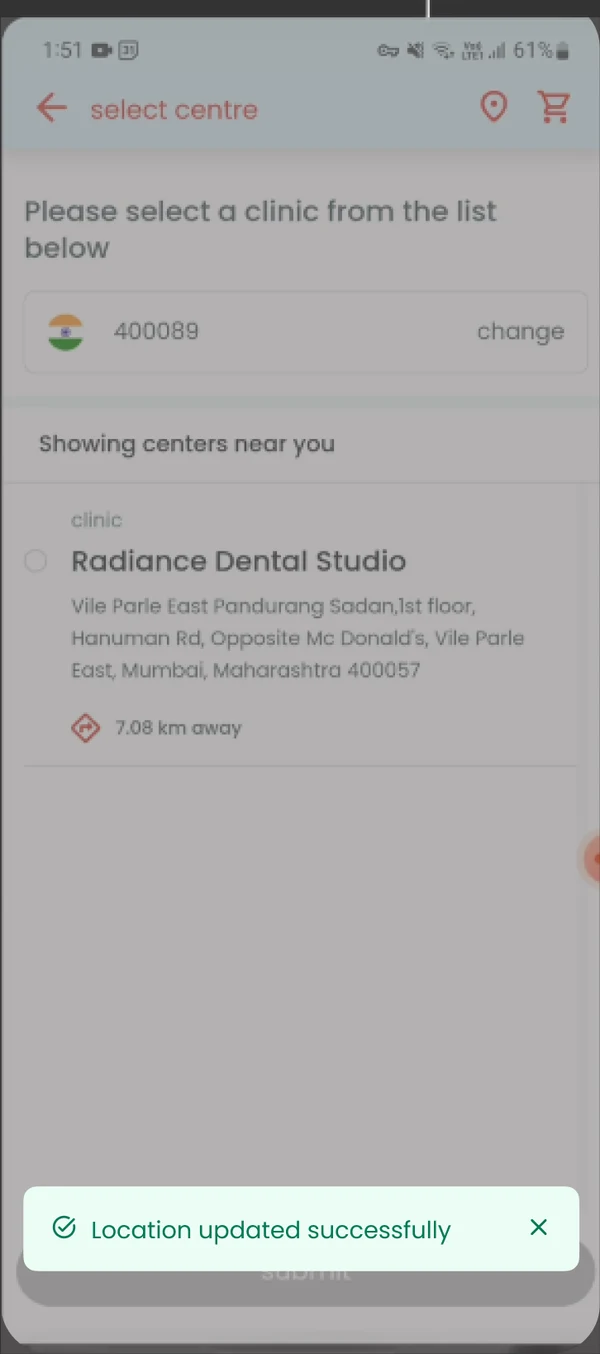 02Hidden toast
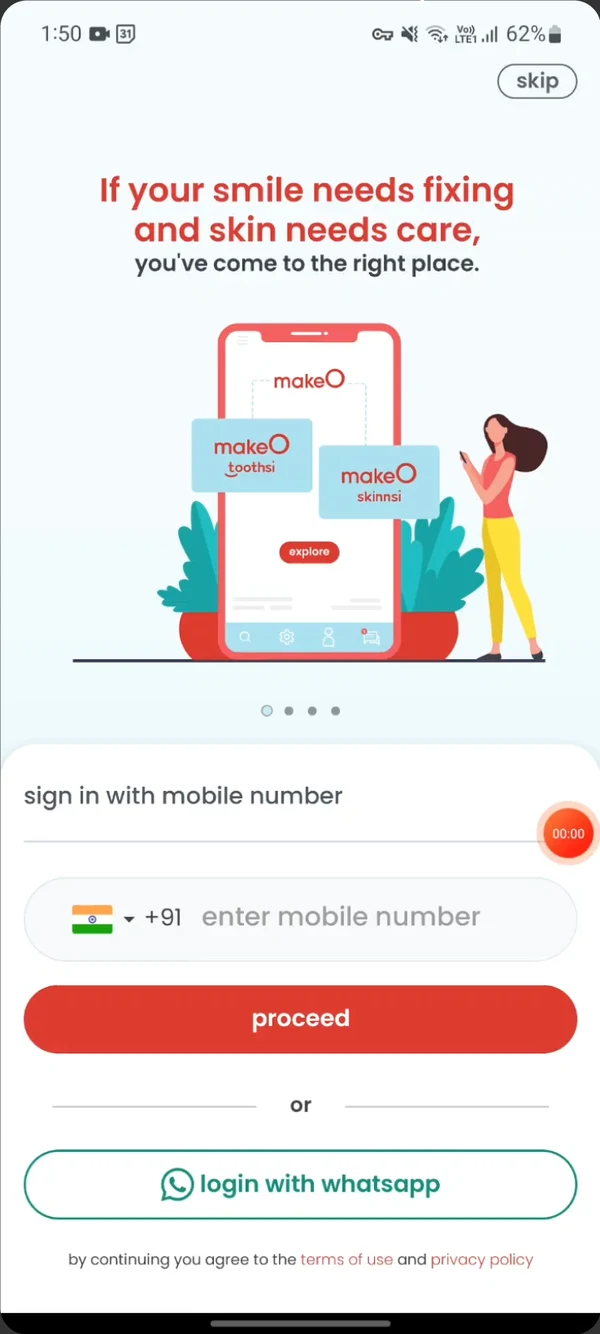 03Multiple loaders
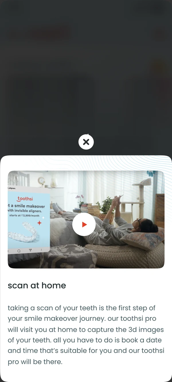 04PNG close icon
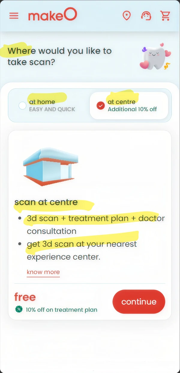 05Casing and type
No usage guidelines existed, so each designer used different icon styles across the five navigation tabs.
An unmanaged stacking order put the toast message behind other parts of the interface.
Several loaders appeared at once, which changed how onboarding felt to users.
Close icons were PNGs, so they blurred on high-density screens. An easy fix that stayed unfixed for months.
No rules for capitalisation and no typography tokens, so copy styling drifted from screen to screen.
Developers had no single reference for colours, spacing or radius, so each handoff meant guessing.
Approach
If only designers can use a design system, it breaks at handoff. I wanted something the team owned, that product, engineering and design could all read and add to, rather than a UI kit handed down by one designer. It came down to three pieces.
Published components and variants, with auto-layout rules. Designers stopped rebuilding the same things, and new screens started from parts that already worked.

22 pages of documentation covering usage rules, do’s and don’ts and spacing, written for product managers and developers too. People started using the component names in everyday conversation.

Tokens for colour, spacing and radius gave developers one place to look. With icons published to Strapi, they could fetch assets without asking a designer.
Six decisions that shaped the system, and what each one cost.
With 3 people and 4 products, I kept phase 1 to mobile components, since that’s where most users were. Doing responsive web as well would have doubled the timeline.
Trade-off: web components moved to phase 2.
The team already worked in Figma, and Strapi let developers pull icons themselves, which cut out a lot of back-and-forth.
Trade-off: we depended on a vendor, which we accepted for speed.
I wrote the documentation for product managers and developers as well, so the system felt shared. If only designers understand it, it falls apart at handoff.
Trade-off: more documentation time up front.
Early tokens used saturated colours. After WCAG AA contrast checks and feedback from the team, I switched to pastel tones that still felt like the brand.
Trade-off: some early designs needed rework.
The bottom drawer uses flexible swap slots instead of fixed layouts, so a slightly different use case doesn’t break it.
Trade-off: harder to document at first.
I set up colours, spacing, radius and typography before building any components, so every component started out consistent.
Trade-off: slower visible progress early on.
Components
Each one comes with its states, usage guidelines and token references, so designers and developers build it the same way.
TokensColourSpacingRadiusTypography
Library file · 6 groups
Collective components · separate filePatterns assembled from the library
4 productsIndia and UAE
Tokens feed one library file in six groups; a separate file assembles them into collective components that the products use. The key components are marked in orange; five of them are shown in detail below.

Toast message · Feedback
For action feedback, progress updates, timeout warnings and guidance, while taking up as little of the screen as possible.
The toast has an action button and a close button, and three states: success, warning and failure.
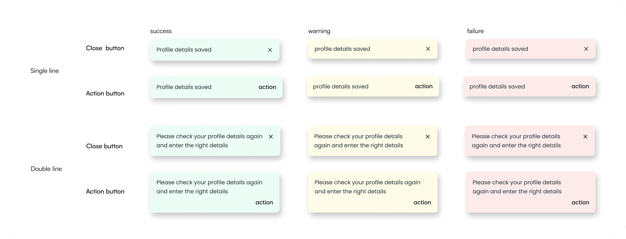

It disappears after 3 to 5 seconds, depending on whether the text runs to one line or two. You can add a close button so people can dismiss it sooner.

You can switch between one and two lines in a single step, turn the action button and close icon on or off, and edit the text inside the component.
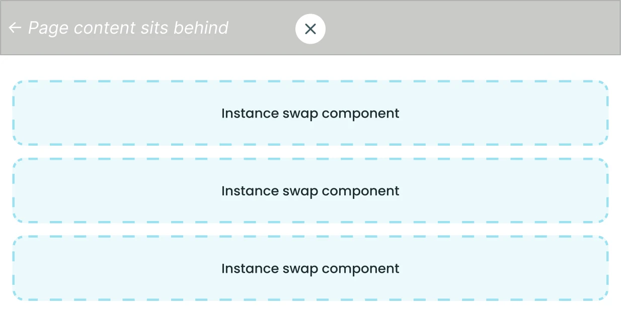
Bottom drawer · Overlay, used the most
Shows information about the current page without taking people away from it, like the details of a procedure or a short set of filters.
Instance swap slots let any content drop in without breaking the component, so designers could adapt it to new flows.
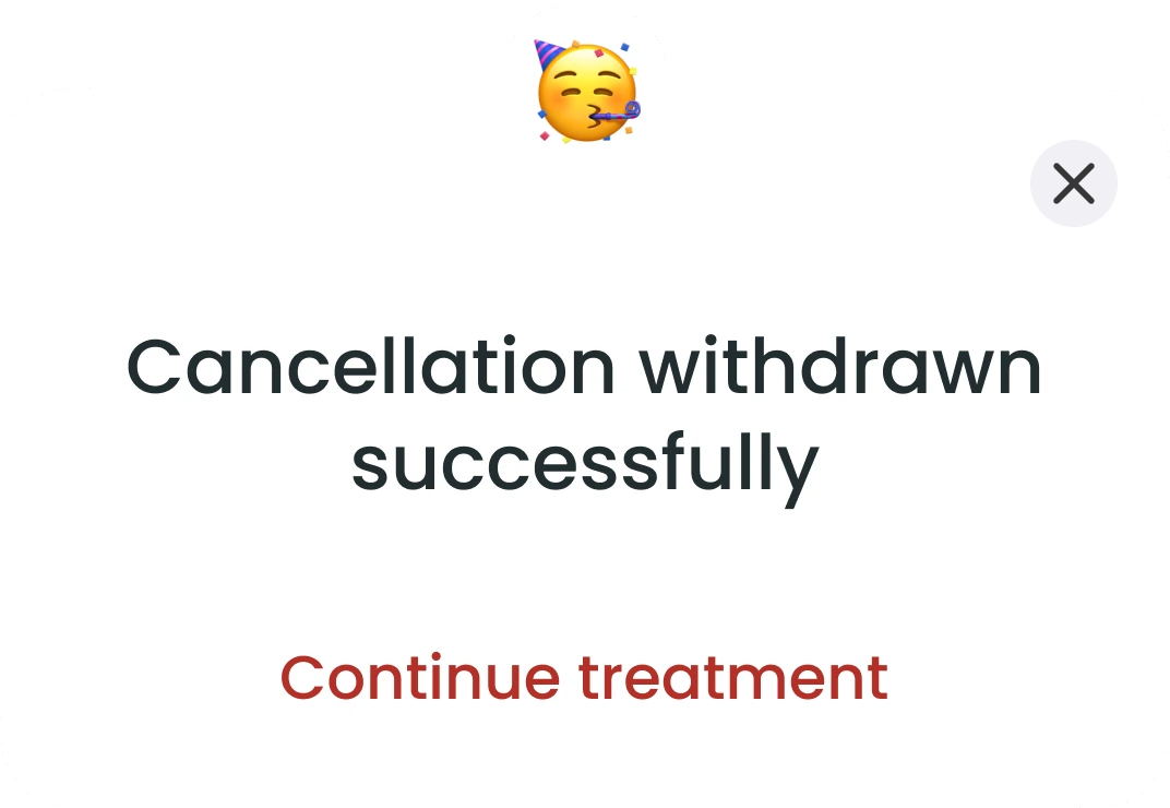
Dialog box · Overlay, blocking
For critical information that needs attention right away. It blocks the user until they deal with it.
Info-only and action-required variants. We used it sparingly: only for decisions that have to block, never for confirmations that can wait.
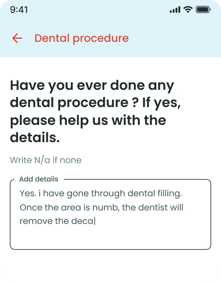
Para-text field · Form input
A multi-line input that grows with the text, with an optional word limit and a floating label that lifts on focus.
Five states, each with its own visual cue.
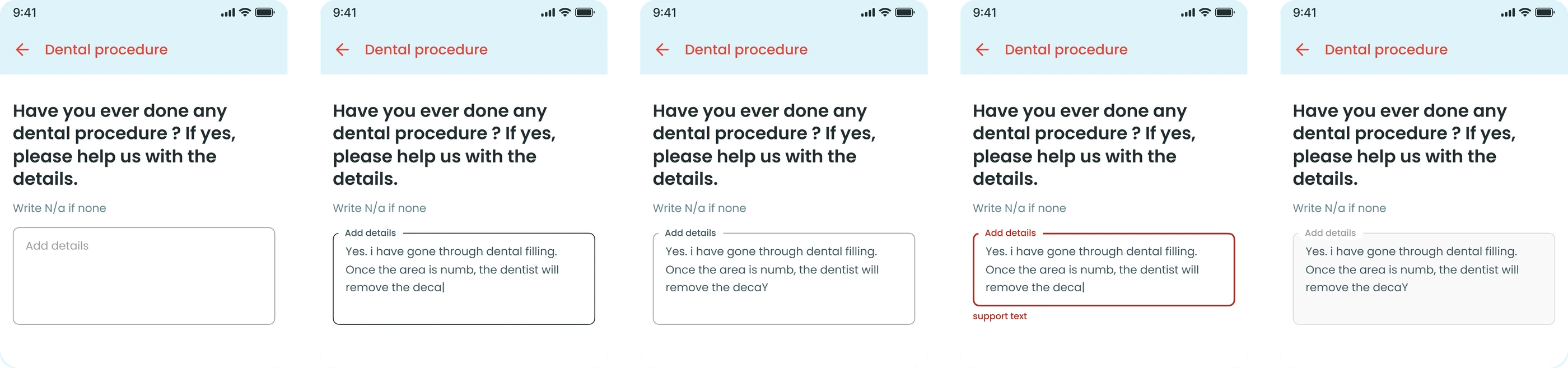
Before any input.
Being typed in.
After the user finishes.
Invalid input, with a message.
Temporarily unavailable.
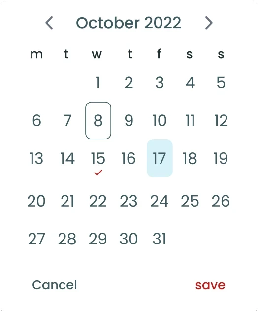
Date selection · Form input, booking flows
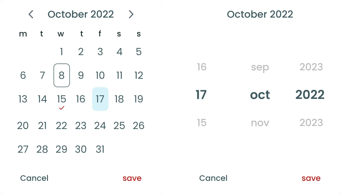
Lets people pick an appointment date, with clear markers for available, booked and selected days.
A calendar for booking, and a scroll picker for day, month and year where a calendar doesn’t fit.
And the rest of the kit
Accordions, checkboxes, radio buttons, text fields, selection tabs, navigation tabs, pills navigation, headers, footer navigation, upload and multiple upload, desktop pop-ups and media dimensions, alongside brand colours and typography.
Iteration
My first toast had high-contrast borders and saturated backgrounds so it would stand out. The team found it too heavy, and it didn’t match our design principles. I switched to the pastel palette from our design guides and checked every colour against black text; all of them passed WCAG AA. The new version was lighter, on brand and still accessible.
01Ideation 1
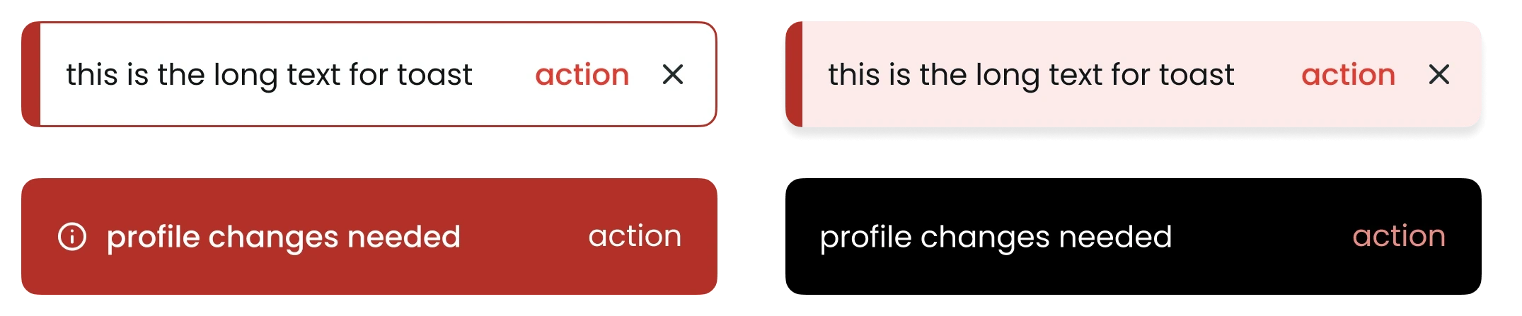
Review from team
“We need to maintain the colorful vibe while using the pastel colors but keep the component simple for better accessibility.”
02Ideation 2
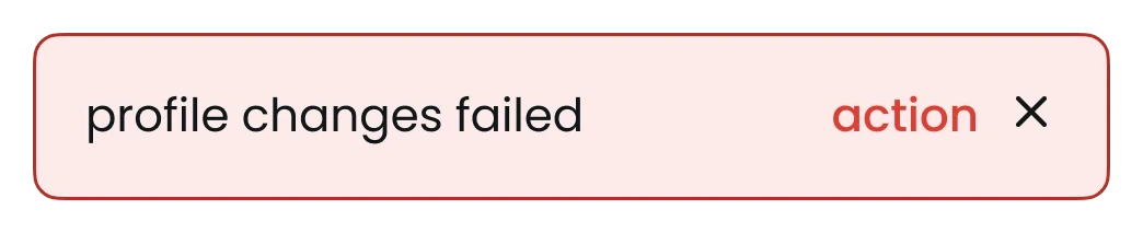
Review from team
“Do we need to use the border? What could be the possible variations for 2-line text?”
03Final
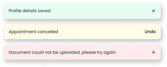
No border, pastel fills and a soft shadow, with single and double line versions. Every colour passes WCAG AA against black text.
Because the team shaped it, they treated it as theirs.
Outcome
One design system now covers the customer app, the service team app, the admin tool and the website, and every component is documented for design, product and development.
Impact
4
The customer app, service team app, admin tool and website all run on one system.
1–2
A major flow took 1–2 days less to finish once common components were available in every file.
10–20
Published and documented, each with states, usage guidelines and developer token references.
0
With icons on Strapi, developers stopped asking designers for assets. They served themselves, the icons stayed consistent, and they loaded faster.
“Once we standardised our icon pipeline through Strapi and introduced the flexible bottom drawer component, developers became fully self-sufficient with assets. Icons across all our apps became consistent overnight, and load times improved. The bottom drawer’s instance swap design meant every designer could adapt it to new flows without breaking anything. It genuinely felt like the whole team had built it together.”
Klinikal worked, but most of it was built by hand. Today I’d hand the slow parts to AI and keep the decisions for myself: what belongs in the system, and why.
Collecting components across four products meant hunting through screens by hand. Today a plugin or AI pass could group the live screens into near-duplicates (nine slightly different buttons, say), and I’d spend my time deciding what becomes a component instead of finding them.
Developers worked from specs and filled in the gaps themselves. Linking each Figma component to its code with Code Connect and Figma’s MCP server would give developers, and their AI tools, the real component and its tokens. Their feedback would also reach the library while it’s still being built.
Rules like “never stack two toasts” only lived in the documentation. QA agents running the real checkout and booking flows on staging could catch screens that drift from the system before release, so the rules get checked instead of just written down.
“The measure of this system’s success was not the number of components published. It was the moment a PM could read the documentation and feel included, the moment a developer stopped asking for assets, and the moment a new designer could onboard in days instead of months.”